Nobody reads discharge papers. So I made ours easier to read.
Think about what pickup actually looks like. The owner's holding a leash, a cone, a bag of meds and a credit card, and my tech is going over the instructions while the dog pulls toward the door. Most of what gets said there is gone by the time they're in the car. The paper is what's left, so the paper has to do the job.
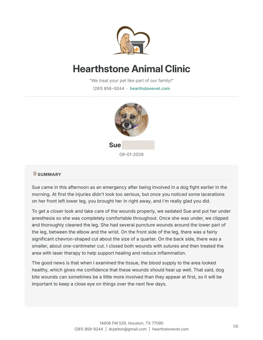
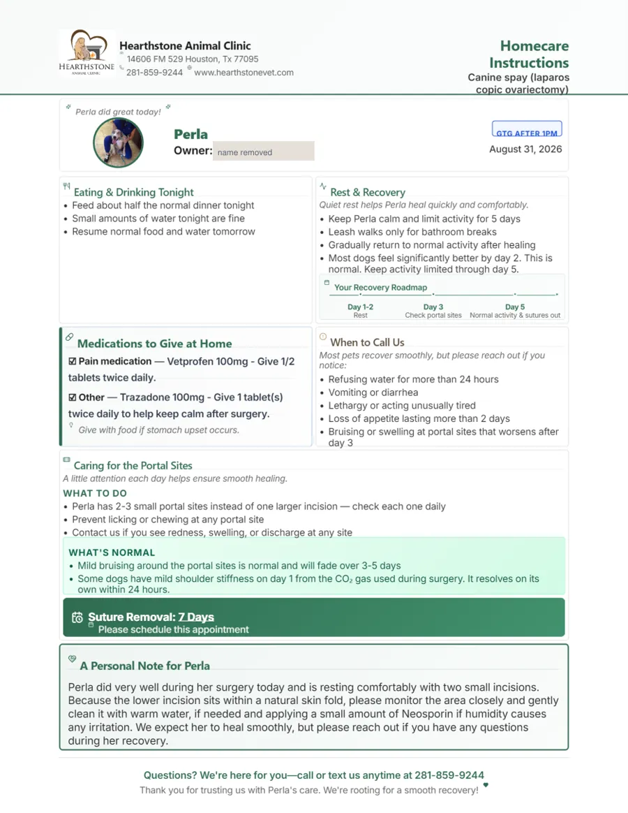
Both of my tools already wrote good instructions. Scribe writes them from what I say in the exam room, in my voice. DischargePro builds the surgery and dental sheets. The writing wasn't the problem. They looked like a lab report: gray boxes, a lot of text, and the one thing an owner needed that night was somewhere on page two.
look at the printouts, etc, could we make it even feel a little less "clinical" and make the sections have the cute icon/graphic ... BUT also make like kind of more handwritten looking blocks, ? and cute arrows for important stuff/areas just dont get crazy
Cream paper blocks with hand-lettered headings, a small watercolor icon for each section, and one hand-drawn arrow pointing at the Tonight box that says "keep this handy."
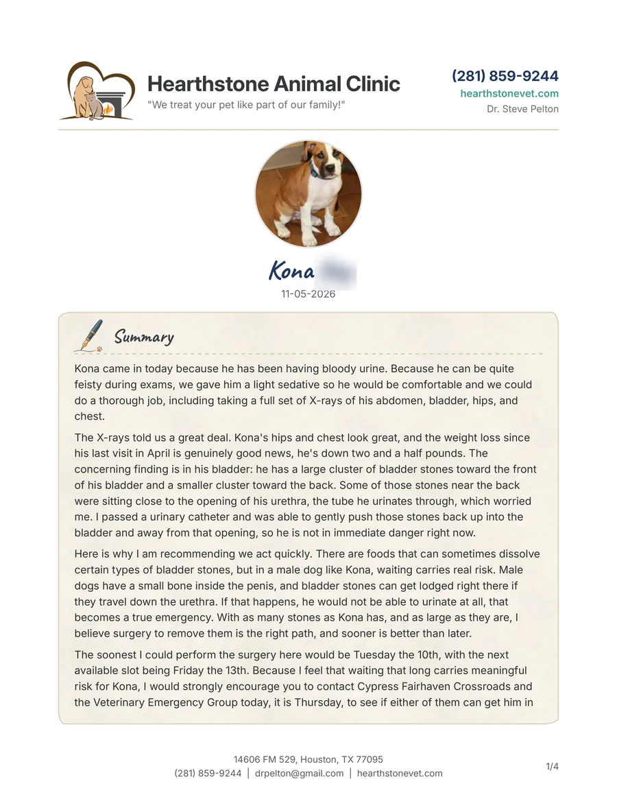
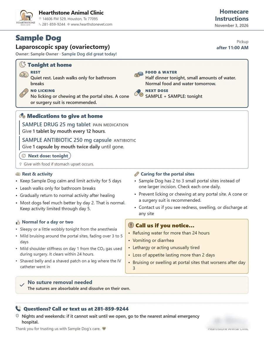
The change I care about most is the Tonight box. Medicine, food and activity for the first night, in one place, near the top. If an owner reads nothing else, that's the part I want read. Everything after it is there for the second read, when they're home and the dog's asleep.
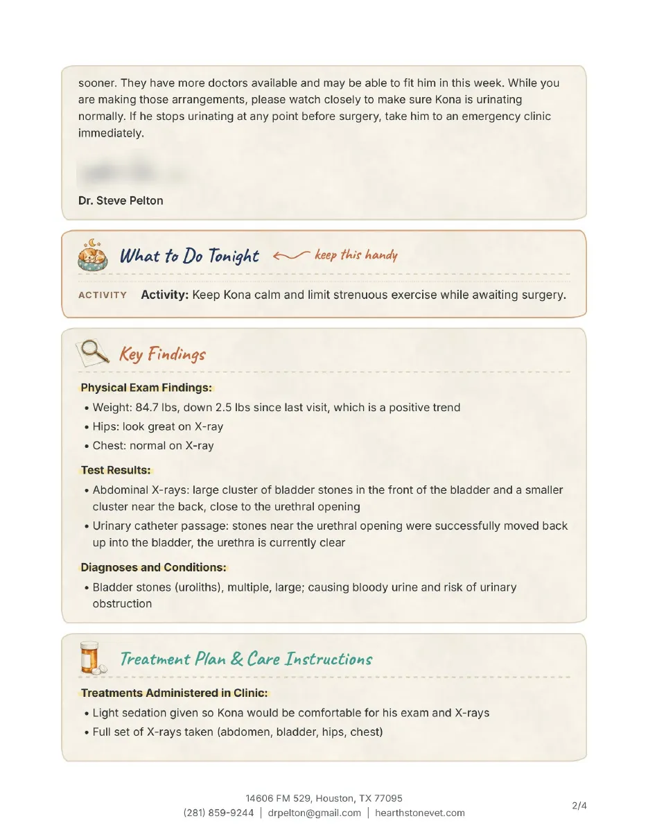
Not every idea survived. For a couple of days the meds had little check-off boxes for each dose. They looked unfinished on paper, and I'm pretty sure nobody was going to use them, so they came back out. The "next dose due" line stayed. That one people actually use.
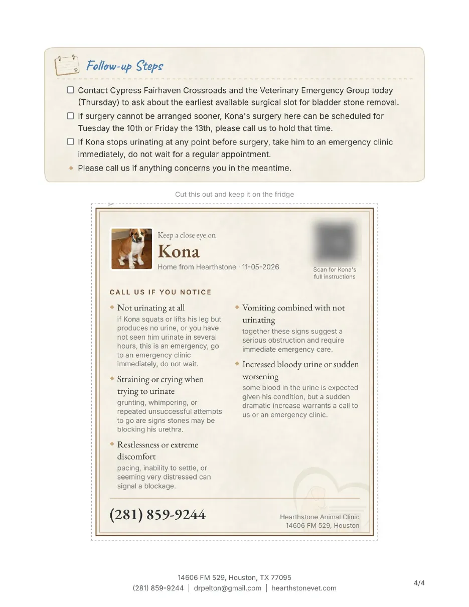
The last page is a card with the dog's picture, what to call about, and our number in big type, with dashed lines around it so it can be cut out and stuck on the fridge. That's the page I'd want if it were my dog at 2 in the morning.
DischargePro got the same treatment the next week. Its sheets now open with a Tonight at home box (rest, food and water, no licking, next dose), the medications are in one card with the dose in bold, and the call-us signs sit in their own amber box. I had it paint six sets of icons and picked the one that looked least like clip art. A couple of the words changed too, because I'd been saying them in the room and they weren't on the paper: back to normal activity after 10 to 14 days, and a cone or a surgery suit is recommended, since we don't send either one home.
The smaller things that add up
-
Cards stay whole
A findings card or the warning signs never split across two pages anymore. If one doesn't fit, it moves to the next page.
-
The owner's link
The QR code opens the same sheet online, word for word, and it updates if I fix something after they've left.
-
Bigger photo
The pet's picture and our logo got bigger once the new layout freed up room on page one.
-
Teeth by area
After a dental, the pulled teeth are listed by part of the mouth, so an owner can find them.
-
Recording on my phone
I can start Scribe from my phone, standing at the exam table, instead of walking back to a computer.
If you run a clinic, look at your own go-home papers the way an owner does: tired, in a parking lot, with a dog in the back seat. You'll probably find the same thing I did. The information was all there. It just wasn't in the order they needed it.